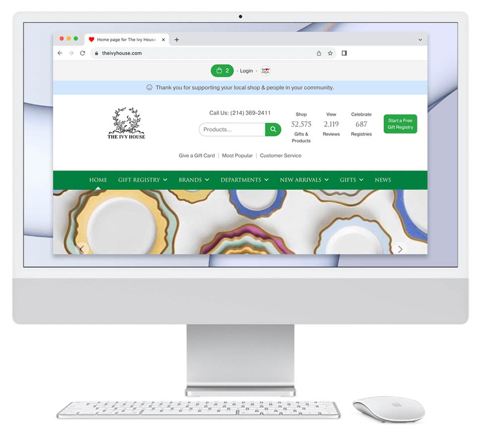
We are working on this design for a home goods company. The current website is at left; our proposed updated design is on the right. Notes about the design:
- I updated logo to be clean, contemporary, and fresh.
- I put the hyperlinks to the categories and the brands directly on the home page. This is good for ranking well in Google.
- I was sure to put lots of smiling faces on the home page, and in the top banner. This builds trust with shoppers.
- The phone number is big and easy to read in the top right. The website is a sales processing tool, as well as as sales lead generator; phone call sales are just as good as web sales.
- There is a product slideshow.
- The footer of the page shows a map of the store's location. People are more likely to trust a store which they feel they can visit or sense that others are.
Tags:
new york pennsylvania solarek web design comparison
View Post on Shop Local